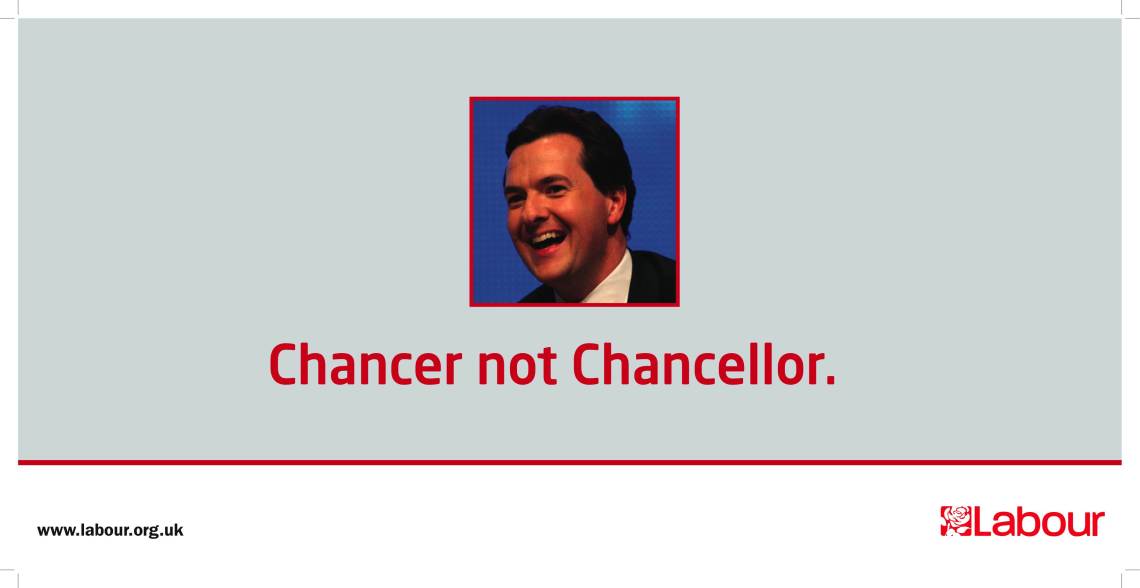
This is the poster that The Labour Party erected in Brighton, the location for the Conservative Party’s Spring Forum, over the weekend. It is so painfully bad, on so many levels.
The pun-tastic headline is very poor. It’s not clever, funny or insightful.
The art direction is terrible. Is that the best photograph they could find for Osborne? Was there no time to cut him and place on another background so that the textured blue didn’t contrast so appallingly badly with the flat grey / red / black colour scheme of the rest of the poster? The use of a square box to contain Osborne’s face within the centre of the rectangular poster is also visually jarring. The whole thing looks like something I could have done on PowerPoint in about 5 minutes.
Compare it with the posters the Green Party put up during the Labour Party’s last conference in Brighton and the true scale of the creative and strategic depths that the Labour Party have plunged to with this poster will be even more evident.
What an absolute turkey.

