


The focus of the Labour Party’s communication activity has now pivoted from defence against UKIP to attack on the old foe that is the Conservative Party.
The lines of attack are now familiar and will become more so as we move ever closer towards polling day in May next year.
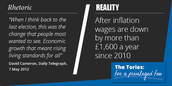
What is new is that Labour have created a brand logo for their attack. Creating a singular visual point of consistency which encapsulates the values of an organisation and lodges itself into the minds of an audience is hardly a new practice, but it’s fairly unusual to create one for an opponent.
It seems like a smart move to me and it will be interesting to see if it’s something that lasts beyond conference season.

You’ve left out Cameron saying: I want coalition to be the ‘greenest government ever’…