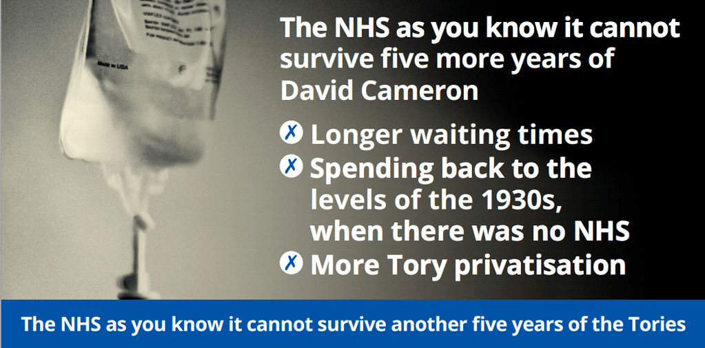
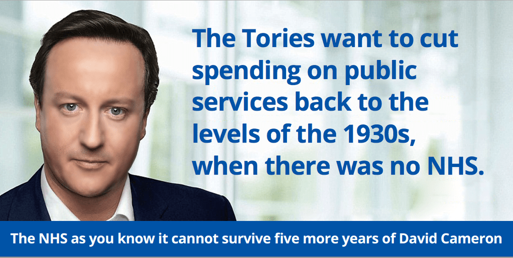
The Labour Party have released their first batch of posters since the start of the official General Election 2015 campaign.
Both focus on the NHS. And both are absolutely terrible.
One features a meme from the 2010 election as its basis and includes a 21 word headline (one should always aim for 8 or less). The other uses a stock image and the level or art direction you would expect from someone using PowerPoint for the first time.
This sort of thing makes the party look so completely cheap and thoughtless. Not exactly two values which people aspire to associate themselves with.


great posters, sad blog by Benedict